
Check Out Our New Community Data Dashboard – July 2024
July 10, 2024
Explore an interactive dashboard of insights from over $4 million in social media data…
As each of us continue to make the benefits of the IRA tangible and equitable for everyday people, we want to equip you with new tools to interact with the Hub’s data, which represents millions in ad spend from more than 12 organizations (as of July 2024). With our partner 89up, we built an interactive dashboard of widgets to help you explore how IRA and clean-energy campaigns have been performing since January 2023, and how to integrate these insights to develop campaign goals, design effective ads, measure progress, and iterate your campaigns.
| Summary of Dashboard Widgets |
| Benchmark Widgets |
| CTR Benchmark: The average click-through-rate (CTR), the number of clicks on an ad divided by the number of times the ad was seen (impressions)CPC Benchmark: The average cost-per-click (CPC), the cost of an ad divided by the clicks on the adsCPM Benchmark: The cost-per-mille (CPM), or how much an advertiser pays for one thousand views (impressions) of an ad |
| Other Widgets |
| Time Series Chart: Five data streams together overtime–CTR, CPC, CPM ad spend, and number of adsInspiration: Best performing content to inspire you when crafting your own messages Top Ad Copy: Above average ad copy for specific audiences, and CJ framingAd Performance: The performance of tone and message for specific audiences. This can inform how you craft ad copy and creative. |
Benchmark Widgets: How to use them in your own campaign
Benchmarks can help you understand how your campaigns are performing against the averages from diverse campaigns reflected in the Hub.
We recommended using the Hub’s benchmark widgets to:
- Assess overall performance: Compare your ads to the thousands of others represented in the benchmarks. Are you over- or under-performing? What might the reasons be?
- Inform budget and resource allocation. You can use benchmarks ahead of a campaign to estimate the scale and budget needed for the desired impact.
- Understand the value of different platforms. Comparing platform benchmarks can help identify the most effective placement of your ads.
A word of caution: It is important to keep in mind the benchmarks are averages and there are many reasons why your campaign might not follow the average. For example, your campaign may perform poorly compared to the averages if you’re targeting a traditionally hard-to-reach audience (see the Hub’s audience-specific benchmarks). Or if you are asking people to take a more difficult action. In these cases, your campaign’s performance can still be valuable if it aligns with your objectives. Therefore, keep in mind each benchmark is meant to be a starting point but is only one data point against which to evaluate your campaign.
Benchmark Widgets
CTR Widget
What is this widget showing?
This CTR widget shows the average click-through-rate (CTR), or the number of clicks on an ad divided by the number of times the ad was seen (impressions). Many ads fall above or below this average, with the majority1 between 0.00% and 2.63%. Use the filter in the top right hand corner to view CTR by platform.
🚀 How to use this widget to benchmark your performance:
If your campaign’s CTR is higher than the benchmark then that may indicate that the content is performing well.
If your campaign’s CTR is lower than the benchmark that could mean that it is not performing well. Many factors, including audience and asks in your messaging heavily influence your CTR performance (see the Hub’s audience-specific benchmarks). If you are targeting hard to reach audiences for example, a low CTR might still be acceptable.
Rather than seeing advertisements that fall below this average as an automatic failure, we instead suggest investigating what might explain this performance, and testing variations of your message and ad strategy to make sure you’re getting the best possible CTR.
🎯 Setting goals. This widget can help you set goals and determine how to allocate your resources in your planning stage. For example, if the average CTR is 2% and you want 1,000 people in your community to land on your website, then you will likely need to show your advertisement to 50,000 people (and you can use the benchmarks below to estimate how much that might cost).
CPC Widget
What is this widget showing?
This CPC widget shows the average cost-per-click (CPC), or the cost of an ad divided by the clicks on the ad. Many ads fall above or below this average, with the majority1 between $0.39 and $2.33. Use the filter on the top right corner to view CPC by platform.
🚀 How to use this widget to benchmark your performance:
If your campaign’s CPC is lower than the benchmark then it is likely that the content is performing well.
If your campaign’s CPC is higher than the benchmark that could mean that it is not performing well. Numerous factors such as time of year, bidding strategy, audience, and ask will have a large impact on CPC. It is important to use this benchmark as an initial diagnostic tool, to determine if further testing and investigation is needed.
💵 Budget allocation. This widget is a useful tool for setting budgets in your planning phase. For example if the average CPC for the platform you are using is $2 and you want 1,000 people to click through then you may need around $2,000.
CPM Widget
What is this widget showing?
This CPM widget shows the cost-per-mille (CPM), or how much an advertiser pays for one thousand views (impressions) of an ad. Many ads fall above or below this average, with the majority1 between $3.33 and $20.00. Some ads had extremely high CPMs which increased the mean to $50.95. You can use the filters in the top right corner to compare platforms.
How to use this widget:
🔭 Planning awareness campaigns. CPMs are best used for thinking through how much you need to spend to raise awareness of a topic, since viewing an advertisement is much more passive than clicking on it.
There are no hard and fast rules about how many times someone needs to see something before it sticks in the brain—that depends on the person and the content. But the old advertising rule of thumb is people need to see your advertisement 7 times before they will remember it.
- 1a1b1cThat is, the middle 51% of ads (from the 24.5th to the 75.5th percentile). As of July 23, 2024.
Other Widgets
Time Series Chart Widget
What is this widget showing?
This Time Series Chart widget shows five data streams together over time–CTR, CPC, CPM, ad spend, and number of ads.
How to use this widget:
📈 Spotting trends. The time series widget helps spot trends and patterns in the data over time. This can help us learn when there are peaks and troughs in specific metrics and contextualize your own data over time.
For example, the spike across the charts in August 2023 shows how there was a sharp increase in total spend across campaigns in the Hub, and this corresponds with a spike in costs for clicks and impressions—possibly the result of too much simultaneous bidding over the same audiences. Also, some campaigners find that CPCs increase around December as commercial advertisers compete for attention with their holiday advertisements.
🌌 Understanding wider context. The time series chart allows you to compare your historic performance data against the average. For example, a cost spike in your campaigns may reflect what other advertisers were also experiencing. And these charts allow us to see if, as a movement, we are collectively improving or investing more over time.
Top Ad Copy Widget
What is this widget showing?
This Top Ad Copy widget shows the top performing ad copy for specific audiences. You can use the following filters:
- Audience filter: See the ad copy with the highest CTR for each audience that’s of interest to you. See audience definitions.
- Climate justice filter: Show ads with the highest CTR that have climate and environmental justice framing.
“Messaging type” represents our coding of the framing strategies used by the ads (see our definitions). Values in the ‘Lift’ column refer to the percentage point difference of the ad above the average2 for ads for that audience. For example, an ad with a 15% CTR with the “Women” filter applied has a 8.5% point lift above the average for women (which happens to be 6.5%). Ads with less than $10 spend are excluded from display, and the list is limited to the top 20 best performing3 ads.
How to use this widget:
🔬🎨 Learn and inspire. This data helps us learn how you can tailor your ad copy to certain audiences to generate more engagement. See trends in phrases and let it inspire you as you create new ads for your own campaigns!
Tone & Message Widget
What is this showing?
This Tone & Message widget shows the ad performance of various tones and messaging, with the ability to drill down by audience segment. This can inform how you craft ad creative and copy. Please see our messaging guidance for a summary of take aways from this dataset.
- Category filter: View the performance of either ad copy tone (positive/negative/neutral), or ad message type (such as health or economic messaging).
- Platform filter: View all results or just those from Meta or LinkedIn.
- Audience filter: You can further filter the results you see, by using the “Audiences” chart in the bottom left to filter by audience.
Notes: This widget only displays results when the differences are statistically significant (hence, filtering by some audiences is not available). For more on this, and how we define audiences, tone, and message types, see our June report methodology.
How to use this widget:
🙂😡Tailoring content to audiences. This data shows how much specific audiences engage with certain tones and message types. That can help you customize ad copy to different groups, informed by what tone or topic they might engage with more. For example, filtering by tone and BIPOC audiences in the widget tells us that ads with a positive tone tended to receive lower CTRs than those with neutral or negative tones; this suggests you might want to be less positive in your BIPOC-targeted ads.
- 2All displayed ads had lifts that were statistically significant.
- 3You may see ads with the same copy appear multiple times in the list. This is because the same copy was used multiple times in different ways, such as running them at different times or different audiences, hence their differences in CTR
Inspiration Station
Open configuration optionsOpen configuration options←→
What is this showing?
This Inspiration widget shows the best performing content for various audiences.
How to use this widget:
🖌️ Helping you think of new content. Use these examples to inspire you as you create your own ads.
Related Resources
State & Local Energy Implementation Messaging Guide by Climate Power & LCV
This new guidebook provides comprehensive messaging and communications tools to tell the story of President Biden’s clean energy plan in your communities, including:
- An overview of key communications tactics
- Messaging do’s and don’ts
- Relevant polling & research
- Local case studies
- Policy implementation resources
- Coalition partner directory
- State fact sheets
White House Launches New Savings Explorer Tool
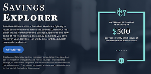
The White House recently launched a new tool for people to see how Biden’s policies can help them save money on everyday necessities including utilities, clean energy investments, and more.
Environmental Polling Roundup – July 19th
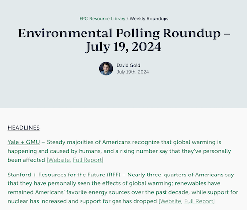
This latest post by David Gold at the Environmental Polling Consortium highlights climate and environment headlines, data points, and key takeaways from recent public polls–including new polling on Americans’ attitudes about climate change, views on different energy sources, and beliefs about the links between fossil fuel pollution and health problems.
Biden-Harris Administration Announces $4.3 Billion in Grants for Community-Driven Solutions to Cut Climate Pollution Across America
The Administration recently announced 25 recipients of over $4.3 billion in Climate Pollution Reduction Grants to deploy new technologies and programs to reduce greenhouse gases and other harmful pollution across 30 states including one Tribe. The Administration estimates that combined, the proposed projects will reduce greenhouse gases by 971 million metric tons of carbon dioxide by 2050.
Help Center
How Do I Get Involved?
The data and insights in this Hub gets better with more participation, and if you are here, the chances are pretty good that you’ve got something to contribute. There are a variety of ways you can get involved, from contributing ad data, to sharing reports you are creating with your own polling or focus groups. Let’s have a conversation about how you can contribute to our effort. Reach us by email here, and we’ll get the ball rolling.
Data FAQs
Wow, that’s a lot of data. You are probably curious about how we’re handling it and how we’re keeping it secure. We’ve got a document for you! Check out our data FAQ here.
Name Generator
We have created this name generator that can be used by those running ads to create file names for the ad data they are sending to us; doing so will provide consistent naming conventions that will convey to us useful information on the digital ads, enhancing in turn the insights we can offer back to you all.
- Why? Following discussions with others working on the IRA, there has been a demand for more in-depth analysis of ad performance based on multiple factors (like audience and message type). We’ve pinpointed the priority factors to measure, and this name generator will enable us to analyze them across all ads.
- Who is this relevant for? So we can collect the most extensive, useful and accurate insights, we would love for any organizations running ads (with any size budgets) to use the generator to name the files they send us.
- How to get involved? Simply duplicate this doc and follow the instructions in the guide and start generating your file names! If you’ve got questions, you can reach us here.
We want to hear from you!
Have any questions or comments about the data? Have datapoints you think we should consider? Contact us here and let us know.
Quarterly Deep Dives
Session One (April 3)
Session Two (July 10)
A special thank you
We would like to extend a special thank you to 89up. 89up is an impact agency, based in the UK, who will be our partners as we build and make the Hub a more robust and useful tool for everyone who touches IRA work. They’re dealing with the mountain of backend data that we’ll be sorting through, and providing critical thought partnership in our analysis. Check them out at the link.